It is interesting to look at how design technology has changed over time within a carpet and textile studio.
I joined the Design Studio of Hugh Mackay Carpets of Durham in the early Seventies as a Junior Designer after studying printed textiles at what is now Northumbria University in Newcastle upon Tyne.
At that time computers were in their infancy and not generally part of the carpet design process. As with printed textiles and many other applied arts the design process was very much based on traditional methods and materials.
Many designs were derived from very specific sources that the client required. Typically logos, lettering, heraldry were specified and supplied in printed form to be manipulated and arranged into a pleasing pattern.
In many cases the image was copied, traced or projected using the enormous epidiascope projectors found in most studios.
A tracing was manually made and used as the motif. This would then be laid onto the sketch area with carbon paper and arranged as the designer required.
But we are getting ahead of ourselves. What colours were to be used? Carpets were made by 2 types of machine at Mackays. Wilton and Gripper Axminster. Wiltons were limited to 5 colours and Gripper Axminsters to 8.There are ways of increasing the number of colours through clever manipulation of the creel but that’s another story.
In most cases the yarn would be selected from a standard tuft box. If the client insisted and could afford the extra cost the yarn would be dyed to match his sample sometimes using the very latest innovation in colour selection, Pantone shades.
In an earlier era the paint would be ground and mixed by aspiring designers known as Slab Boys. You may be familiar with the trilogy of plays by John Byrne that catches the moment so well.
Technology had marched forward by the Seventies and gouache was readily available in great glass jars with immovable lids that had to stunned into submission with boiling water. Colour names appealed to me, Scarlet Lake sounds like a film star, and who can forget her sisters Carmin and the black sheep of the family, Madder.
As a dense, opaque paint gouache covers brilliantly and gives wonderful deep shades through to very subtle pastels. Mixing to match to tufts is another story and a skill only acquired through much practice. I try to forget the number of pots of brown sludge I had to discard when a mixing went wrong. Frequently you would reach a point where as Macbeth would say “stepped in so far that should I wade no more, Returning were as tedious as go’er” and in would go half a pot of white only for the lot to go shamefully down the sink. I’m sure the River Wear downstream of Mackays was a more colourful place when I was mixing.
Anyone who has used gouache will know it has one drawback, and that is cracking. If you made a mistake you could always paint over but beware because you encouraged cracking. We would add small amounts of Gum Arabic to the final mix if we remembered or anticipated errors. Any design paper that had been manhandled by stampers and weavers could return for repainting very quickly if too much was applied. The only alternative to repainting was the soul destroying act of spongeing out and washing off your painstaking work to start again. But even that was problematical since too rough or too wet a sponge lifted the paper surface and removed the graph lines leaving a woolly mess.
And what happened if you didn’t mix enough paint and ran out ,lets not go there!
A stern lesson in avoiding errors was rapidly learnt and persists to this day. The Undo button still has its uses though.
Hair styles were important in the Seventies as this image illustrates. I am the tall one, top right.
Usually a ground would be washed in first and the images applied.If the designer wanted a textured ground this would be created with sponges and washes and allowed to dry. At this point the organised designer would make their other colours so as not to waste time. The disorganised designer on the other hand, and there were many, would take the opportunity to visit each other designer in turn for appraisal of their work, constructive suggestions, social updates and general banter. Only when the Head designer wearied of their timewasting and drew attention to other work available did the sketch miraculously become workable.
Head Designers in studios had a difficult path to tread. In most cases they had graduated from designer to the position through merit within the same studio or from another company.
In much the same way as promotion in a military situation brings out the man or woman so the best ones inspired and lead from the front, the others turned into “suits” full of their own importance. Fortunately those at Mackays were inspirational ,commanding respect and encouraging my feeble efforts.
A sketch would be made to illustrate a layout and colour placement, usually full scale, correct repeat and matched colours. This was invaluable for the client to visualise the proposed effect and suggest changes. Only when the sketch was approved did the design progress.
Domestic design development was a different proposition completely in that designers had a free hand to create what they felt was a commercial proposition. Many weeks could be spent creating what in many cases was an original artwork only to see it casually moved aside during selection. Considerable passions were aroused during this process and the sanity of the selectors candidly questioned. Designers would become well known in the trade for their particular style and achieve almost a celebrity status. They would command high wages and move freely between companies eager to employ the latest star.
At this point it is interesting to note that some designers only created sketches. The more mundane work of transferring the design to graph or point paper could be left to lesser mortals. This hierarchy was most apparent in the larger studios where your proximity to the Head Designer indicated seniority and talent. Those closest to the door were literally the first to go.
As a junior designer I felt the breeze from the door all too frequently but that was the way.
Taking a sketch from a senior colleague was a daunting challenge but invaluable training for the future. Transferring a delicate sketch into the rather crude resolution of carpet meant difficult decisions regarding detail. In some cases the essence of the sketch changed significantly as the resolution could be as low as 30 tufts per square inch. Good designers knew this and sketched accordingly.
In some instances a full colour sketch was not necessary and a charcoal drawing was sufficient to meet deadlines. Woe betide the junior designer who laboured over a challenging subject only to forget to apply fixative and had to rework the smudgy mess complete with Jackson Pollock swirls indicated by the client.
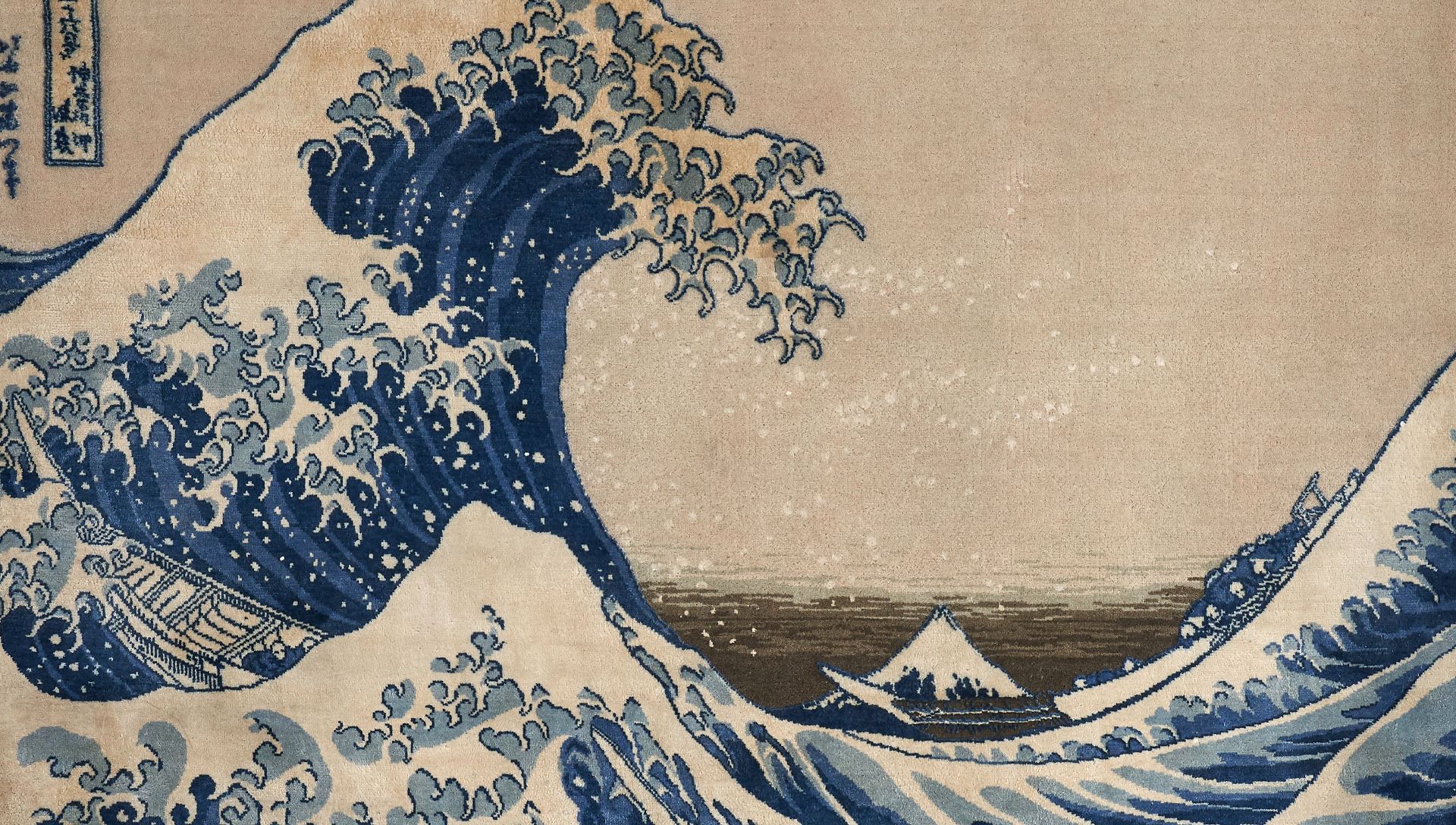
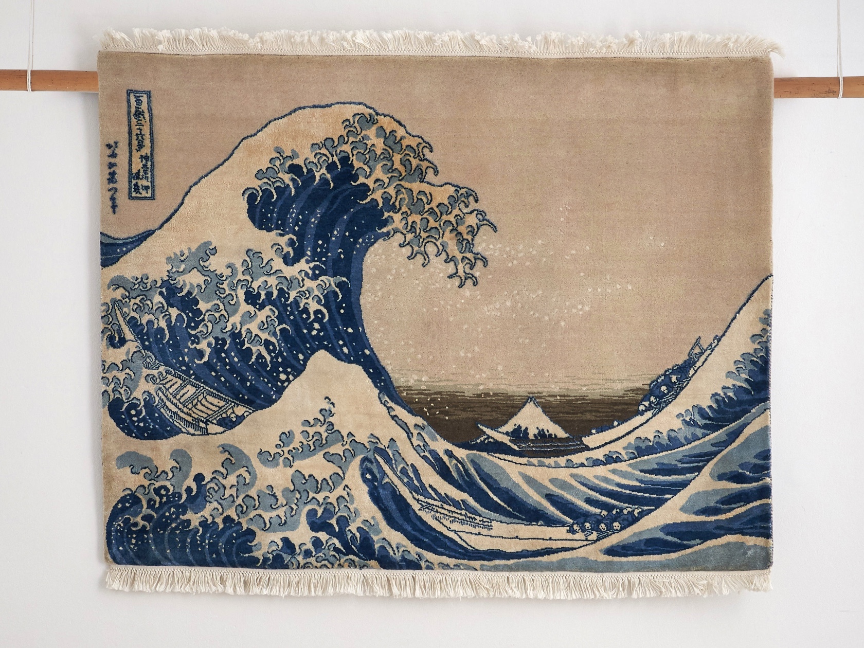
Drafting a design reduces the sketch to single squares which represent tufts of the actual carpet. The quality of the carpet is reflected in the tuft count, usually per square inch. A budget quality carpet can have a knot rate as low as 28 although that is unusual today. A fine hand knotted rug, such as UK Heritage Rugs British Museum Collection, has a knot rate of 200 and is correspondingly more detailed and luxurious.
By the end of the Eighties the first computer software for Carpet design became available and was eagerly accepted by those who could afford it.
To be continued..